|
|
Post by Nici on Apr 7, 2010 8:06:40 GMT -5
Awesome! ;D Great work!
|
|
|
|
Post by Tim on Apr 25, 2010 12:55:50 GMT -5
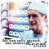
I thought I had to practice my icon-skills. I've actually never done icons before but I hope they turned out ok:  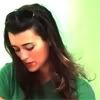  There's one more at the Tiva thread . |
|
|
|
Post by Tali on Apr 26, 2010 2:07:29 GMT -5
You did very good with the icons, I like them a lot  |
|
|
|
Post by dmc4me on Apr 26, 2010 6:09:36 GMT -5
Very nice! ;D
|
|
|
|
Post by Tim on Apr 26, 2010 9:23:47 GMT -5
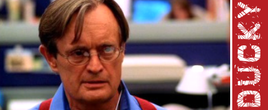
Thank you. I thought that I could need some more practice:   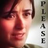 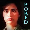 I promise to use other characters too but right now I just couldn't resist Cote's funny faces ;D |
|
|
|
Post by Tali on Apr 26, 2010 12:51:37 GMT -5
I completely love them, I'm even thinking in snagging some and of course credit will be given |
|
|
|
Post by Mikki on Apr 26, 2010 20:14:40 GMT -5
Thank you. I thought that I could need some more practice: I promise to use other characters too but right now I just couldn't resist Cote's funny faces ;D Great job! |
|
jethrene
Forensic Specialist
 Always remember Rule #18
Posts: 307
|
Post by jethrene on Apr 26, 2010 21:15:57 GMT -5
I'd say all those turned out very well. Nice job.  |
|
|
|
Post by Nici on May 1, 2010 12:49:52 GMT -5
Great work on the icons |
|
|
|
Post by Nici on May 27, 2010 8:08:24 GMT -5
Can't wait to see more great stuff |
|
|
|
Post by Tim on May 30, 2010 10:41:23 GMT -5
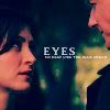
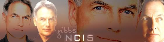
Two new banners. Pretty basic but sometimes less is more right? 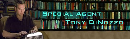 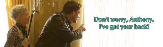 An two icons. Same image but two different effects: 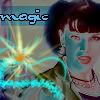  Would love to get a feedback about the first Abby icon because people didn't like that at all. Apparently it's too complicated and overloaded which makes it look like a mess. Thanks. |
|
|
|
Post by Nici on May 30, 2010 12:25:45 GMT -5
Awesome work on your latest Tim The 2nd banner is great. And the icons are cool. The first one I think is too much, you can see Abby but barely. I dunno. good work though |
|
|
|
Post by Tali on May 30, 2010 12:57:26 GMT -5
Awesome banners and about the icons well I like them I think they were well done and are interesting and a good change, I think you did a great job.
|
|
|
|
Post by Mikki on May 30, 2010 22:10:45 GMT -5
As said, I think the first icon is a tad much, but the other one is fine. Great job.
|
|
|
|
Post by dani on May 31, 2010 9:26:59 GMT -5
I really liked the first Abby icon-maybe because it is like a Si Fi movie. The seocnd banner-O.M.G,Tim!This banner totally made me watch Meat Puzzle ;D |
|